Tuesday, April 24, 2012

Back to the Beginning

For my last blog of the semester, I am returning to my first blog: click here! In this blog, I analyzed P. Diddy's Ciroc commercial before I learned about multimedia and design. Now, I am taking another look at this commercial and will critically analyze it with my new knowledge.

Take a look:
    The purpose of this video is simple: it is to promote the lavish, expensive vodka: Ciroc. This video is intended for people of age, of course, and it is to promote that "the fabulous" celebrate with Ciroc. I also still think that it is geared toward people in their late twenties-mid thirties because there is no club scene, there is a relaxing, enjoyable night out with people who look older than 21, but younger than those with gray hair. This commercial contains P. Diddy, along with other individuals who are in tuxedos and long, elegant dresses. One watching this commercial will think that Ciroc vodka is used to celebrate life events and by doing so you look elegant and classy. The actors/actresses in this commercial are laughing, and having a great time with a glass of Ciroc in their hand. The others in this video are around P. Diddy, who is the leader of this group, and they all seem to be having a fabulous time celebrating and drinking this vodka. This gives off the image that Ciroc is classy and fabulous, and it is a vodka that celebrities drink. P. Diddy is a celebrity, personal opinions aside, he makes a lot more money than we do and receives a lot more publicity. Everyone knows P. Diddy. This video is also done in black and white, which may reflect old Hollywood, which represents the rich and famous. Old Hollywood also reflects classy, respectable individuals.
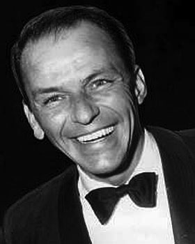
     From a designer's perspective, I think four aspects are extremely important: 1) having a celebrity icon (again- personal opinions aside, he is a celebrity), 2) the color of the commercial, 3) the song chosen, and 4) the happy and classy faces of the actors/actresses. People who idolize P. Diddy or even enjoy his songs, would definitely take into consideration that he drinks this vodka. I definitely had to think about Ciroc and how it tastes- what makes it attract celebrities. Also, I think the black and white color adds the Old Hollywood effect in that it portrays this classy, lavish, and respectable lifestyle. If you drink Ciroc, you are celebrating in the classy way. The song chosen is by Frank Sinatra, who is also a huge icon. "Come Fly with Me" is a very popular song, which would attract people who enjoy this song. I also thought how can this song and this vodka be related? This song makes me feel calm and enjoy life- which is something that I also got from this vodka. Also, I've recently noticed how P. Diddy is wearing a bow tie and I found this picture of Frank Sinatra who is also wearing a bow tie. Coincidence? Or is it that the designers wanted the men to dress like this to resemble Old Hollywood and the classy icons? The people in this video are dressed very professionally and classy- tuxedos and long, elegant dresses. These people are also so happy and glowing. They look as if they are celebrating something by drinking this vodka and they are enjoying every minute of it.
     After taking this class, I really think more critically about commercials, pictures, ads, and graphics that I see. I have learned a great deal from this course and I will apply my knowledge whenever it is appropriate.

Wednesday, April 18, 2012

Mathematics, Differentiation, & Technology!

For this week, I created a toolkit based on mathematics, technology, and differentiation! (Check it out!) I decided to explore the topics before actually creating a name for my toolkit. I came across a lot of articles regarding mathematics, technology, and differentiation. So, I thought of my first colleague: another young mathematics teacher that I share a room with and talk to everyday. As I continued exploring, I saw a lot of differentiation using technology. Then, I thought of my co teacher, who is also young and straight out of graduate school. Thus, I decided to put together a toolkit with articles about mathematics and differentiation using technology. Of course, these are articles that I also find interesting since I am a middle school mathematics teacher and I co teach one period. I figured I could send my toolkit to these two first, and then send it to the other mathematics and special education teachers.


If I were to send my toolkit to an administrator, I would definitely make changes. First, I would not include only mathematics, but all subject areas. I want them to be aware of the resources that teachers can implement in their classrooms. It is important for not only teachers to be aware of these resources, but administrators as well. My toolkit would would a lot longer because there are so many different resources, but I would narrow it down to the articles that relate to the technologies we have available and the curriculum we adhere to.

Although technology is rapidly being implemented in schools, there are some teachers that are afraid of the “T” word. No, not teacher, but technology! All teachers should be willing to accept suggestions and attend workshops regarding technology in their classroom. However, if there still is a teacher that is absolutely terrified of technology, I would change my toolkit further. In my toolkit, I would put things such as worksheet creators, behavior chart cards online, teacher planning chart online, and things to assist him/her first. Then, I would have some article regarding technology for beginners or articles in which you do not need to change your teaching style immensely with the incorporation of technology. Teachers who are reluctant must ease into incorporating technology and they also must recognize how beneficial it is to students and themselves. That is why I would choose resources that benefit the teacher, to show that there is a method behind technology madness, and then resources that would benefit everyone in the classroom.

I really enjoyed creating a toolkit and will continue checking this site to increase my knowledge of technology in the classroom!

Saturday, April 14, 2012

Learning Element

For this week, I planned a learning element for my MMP. I took one lesson, the lesson in which I introduce the golden ratio to my students, and took on the perspective of the teacher and the student (since that is what the learning element essentially is). I critically examined how I looked at the lesson as well as my students. After they have gained the knowledge regarding the golden ratio, they will create their own multimedia presentation of the drawings/images they found that possess the golden ratio.

When I was taking on the perspective of myself, I found writing out the activities more professionally, as when I was taking on the perspective of my students, I was writing in more simplistic language for them to understand. Also, creating the learning element, I thought more critically about the different activities and which sections they belonged in (experimental, conceptualizing, analyzing, and applying).
 

Saturday, February 25, 2012

EDM in 60 seconds

EDM in 60 seconds. What's EDM? EDM stands for Electronic Dance Music. Ever since college, I have been a big "techno" or electronic dance music fan. I've been to concerts in NYC, Miami, Vegas, and Amsterdam. When asked to make a Concept in 60 video, I thought of the footage I have the most of. I am big on taking videos at all of these concerts, so I decided to create a video about my experience at EDM concerts. Usually these concerts last up to 6 hours (with multiple djs), so it was hard for me to break it down to 60 seconds, but I did it! I used Axwell- In the Air as my song (after I stripped all of the original audio) because the rhythm goes with the videos and the song is played by almost all djs. Also, the lyrics represent how you feel the power and love all around you at these concerts. I also listen to this music when I run because it keeps me motivated and "pumped" up. Here is 60 seconds of my EDM concert experiences starting in NYC, moving to Vegas, Miami, and ending in Amsterdam. Enjoy!


Monday, February 20, 2012

Wait, what's a storyboard?

In my screencast, you will be introduced to what a storyboard exactly is, as well as my MMP. I used PowerPoint to create my "storyboard" and a screen cast to show exactly how I will implement these things into my project and why I used the details I did. Storyboarding is  very beneficial because before I created this, my ideas were all over the place. When I laid out all of my ideas and resources for my storyboard, I realized which ones should go with each other. At first I had the four days of notes all together. I realized, that it was not imperative for students to get the notes in four straight days and that this project could be started without the last two days of notes. Storyboarding really helped me organize my thoughts and exactly how I want to use resources and how I want my audience to view my proposal.


Reference

Sunday, February 19, 2012

On the Border

For this exercise, I took a picture from Italy, cropped it into a square, and then added different borders. I used glogster to put all of the pictures together to compare each of them. I used the first four borders from glogster and the last two I used Picnik.
Here is the original picture:
Here is the picture with different borders:

Border #1 (top left): I choose this black border because I really think it focuses on the picture. Since the border is a heavy black color, I think it make the variety of colors in this picture stick out. It doesn't take away from the picture in anyway.

Border #2 (top right): This border, although it is hard to see, has a pattern similar to the one found on page 197 in the middle. It is a light pink and I think it gives off the bright colored theme in this picture. 

Border #3 (middle left): This border is a thin white line. I wanted to use this one because I really think that the picture itself without a border is beautiful. With adding this white border, it doesn't take attention away from the photo and actually makes me pay more attention to the elements in the image.

Border #4 (middle right): I choose this border because I wanted to "pull out" a color from inside the picture. This border matches the houses found in the very middle of the picture. I think this border gives off the theme of this picture belonging to a community.

Border #5 (bottom left): I wanted to test the thin black lines as a border as well for this picture. This border is simple and does not take away from the photo. I think this border adds structure to the picture and adds a "professional" look. I think this border makes the viewer look directly at the picture because it adds a clear ending to all aspects of the picture.

Border #6 (bottom right): This is a border I found on Picnik.com. It is called the "mirror" border because if you can see, it is like a blurred mirror of the parts of the picture it is laying over. I think that it adds a bit of popping up of the border, but it allows the viewer to focus fully on the picture. Furthermore, the border keeps with the colors of the picture.

In all of these borders, I wanted to keep with the theme and the colors within the picture. I learned from Krause (2004), "Edge treatments can be used to reflect and enforce the mood of an image- moods ranging from passive to frenetic, from ornate to industrial" (p. 196). I really think that these borders keep with the theme and reflect on the colors and beauty of all aspects of the picture. I always just put borders on pictures to add something extra, but it is important for me to focus from now on to use a border that keeps with the theme and colors within the picture.

Krause, J. (2004). Design Basics Index: A Graphic Designer’s Guide to Designing Effective Compositions, Selecting Dynamic Components & Developing Creative Concepts. HOW Design Books: Cincinnati, OH.

Friday, February 17, 2012

Keepin with the Theme

While reading about themes, I decided to do the exercise on page 303 in Design Basics Index (2004). I liked the book title, Flirting with the Bully, which reminded me of flirting with the enemy. I immediately had several ideas cross my mind. I wanted to go for a theme where it was playful and "school romantic" but at the same time keep it as looked down upon, not a great love. So I decided to use glogster.com to create this cover:
 I thought this represented flirting, but not in a good way. The main heart, with the title, has spikes sticking out and the second is more subtle with clouds over it and it is dripping with "fail" in the middle. I wanted the title and theme of flirting to pop out so I only used color with the main heart. I use the Polaroids to represent hidden pictures because they are blank, since flirting with the bully is not something you want to brag about. The font I used was more about giving off a flirty look instead of something horrific. 

Here is my second cover. I chose the background for this to represent another school theme, like writing notes to the person you "like". I have the camera because it is representing another scandal, since no one would approve of flirting with the bully. The text adds to the frowned upon theme in this along with the words. I put the words to give off that gossip that is usually found in schools among all students. These words are negative, because once again flirting with the bully is not a positive thing.

After doing this exercise, I realized how important it is to really give off a theme. It is important to establish a theme first, and then build on your image/project surrounding that theme. It is important to have images and graphics that go along with your theme so viewers know what message you are giving off.

Thursday, February 16, 2012

Cream of the Crop

Design Basics Index (2004) has once again taught me to amplify my creative skills. I really do enjoy editing photos on iPhoto and Instagram, so this activity really made me go back to my pictures from a few years back and delve into the meaning of these pictures. I wanted to crop them in a way so that the viewer can see through my eyes.

First, I started with this picture:

This picture was taken in Wildwood, NJ a few years back. I was astonished at the color of the sky. I thought that it looked awesome against the different color flags representing the water park. Thus, I decided to crop this picture to get rid of the unnecessary plain building and telephone poles. I wanted to aim more towards the color of the sky, the car lights, and the colorful flags leading to the water park. I think this photo is so colorful and being able to crop it makes it look even better!

Second photo:
My first photo was a general picture of flowers that I saw in a backyard in Italy. What I wanted to emphasize was that the flowers were gorgeous. How can you see that in the first picture when there is the gorgeous sun beating down on the trees and flowers? I wanted to divert the attention to the actual flowers that I found so amazing. I cropped out the rest of the picture and just focused on the flowers that someone may not see when they first look at the picture. I am again reminded of how beautiful they really are!

Third:

In these photos, I wanted to take notice of the people living along the Tiber River. The first picture captures the essence of the city, but there is so much black that it looks like this city is in the middle of the air. In the second picture, you see more of the reflection of the lights in the water, so it gives you a better understanding of how this town is literally on the Tiber River. I wanted to cut out the extra "blank" parts of the picture to focus in on the night life, literally.

Fourth:


 This is a picture of a terrace in Capri, Italy. I wanted to take a picture of the atmosphere. It was so relaxing and peaceful. There was no one there, there were umbrellas, couches, sun, beautiful view, etc. The top picture doesn't really capture all of that essence. When I look at the second picture, I automatically think of style and comfort in the couches behind the first one. I think of relaxing in the shade on a sunny day. This picture could even be used for an ad! I like this group because you can get rid of the other details that you don't need. This second picture gives you everything you need to feel as if you were there on that day.

Fifth:

I personally enjoy looking at both of these pictures. However, when I looked at the first picture I noticed an element that I wasn't trying to capture on purpose. I realized I captured the visual for a restaurant. Immediately I thought to myself "I could definitely crop this picture to make it seem like I am just advertizing the restaurant's beautiful atmosphere". When you first look at the picture, you don't notice right away that it is a restaurant right on the water. Thus, I wanted to crop this picture to bring out a message the originally picture is displaying. I want the viewers to see this restaurant up close and see how beautifully placed it is right on top of the water. Beautiful ambiance!

Sixth: I saved the best for last : )


I wanted to use this picture to crop because we had a million different pictures to choose from to use as our card. Now, the pictures were great, except they were lacking that intimate close feeling you get when you look at a warm picture. In the first picture, the Christmas tree is awkwardly placed next to me, not in the center, not directly behind me, just awkwardly next to me. Secondly, we are too far way to get that "close" feel. When I cropped it, I aimed for the tree to be in a perfect position behind us to represent Christmas time, but I wanted us to be in front to represent our love and closeness as a family during that time. I think that by cropping this picture and making it closer, it gives the viewer the feeling of closeness as well.

I really learned a lot from cropping and took on a whole new perspective. I looked at pictures in a way I didn't mean for them to be taken. I saw images that if I cropped, they would stand out so much more and bring life to an additional photo. I wanted to bring my photos to life and that is what I have learned from this activity. Just a simply cropping can give off a whole new meaning to a photo!

Sunday, February 12, 2012

Gestalt Laws in Logos

What are the Gestalt laws? The Gestalt laws came to the existance after German psychologists studied the way the human brain perceives objects. According to Golombisky & Hagen (2010), "Die professoren discovered that the brain automatically and unconsciously simplifies, arranges, and orders objects the eyes see. Specific patterns of perception emerged from the research, which became the Gestalt Laws" (p. 76). I decided that I wanted to look at some logos that appeal to the eye because they contain patterns of perception- the Gestalt Laws. Take a look at these four logos- what do they all have in common?


Proximity: The Adidas logo has three lines on top, which are close together so we perceive them as a group, such as one triangle. The Dunkin Donuts logo makes the eye visualize the three objects together as a group. Although Dunkin and Donuts are two different words, they are close together with the coffee so it is easier for the eye to scan this entire logo. All of the lines in the center of the Starbucks logo makes it look like they all belong to the same group because they are so close together. In the Chili's logo, the letters, especially the "hili" all look like they belong to a group because the h is connected to the l, which is making a shape like the chili (get it?). Golombisky & Hagen (2010) state, "The idea is to avoid a busy cluttered layout by physically grouping items together that belong together" (p. 76). In all of these logos, the lines and objects all look as though they are one group, that they belong together.


Continuity- Golombisky & Hagen (2010) state in reference to the pattern of continuity, "Applying this concept can add a sense of direction and movement to your layout" (p. 76). Look at the Dunkin Donuts logo. The eye starts at the coffee on the left and moves across to read Dunkin Donuts. The eye flows across the logo and the colors help as well. If we look at the Adidas logo, our eyes start at the left and gracefully follow the triangle shape, ending at the end of the word. The Starbucks logo is in the shape of a circle, but your eyes are glued to the stars and then follow the circular shape to read the logo. The lines in the center also point to the Starbucks and Coffee (the hair of the figure in the center). Lastly, the Chili's logo gives movement by connecting the H and the L to represent another Chili. This gives such nice flow that it is easy for our eyes to just follow the direction of the logo.

Closure- Golombisky & Hagen (2010) state, "We mentally fill in the gaps in order to complete a perceived shape" (p. 77). In the Adidas logo, even though the shapes are physically connected to form a triangle, our eyes perceive the lines as one triangle. In the Dunkin Donuts logo, there isn't an actual rectangle surrounding the logo, but you can tell that the logo is a rectangle form. For Starbucks, the image in the middle isn't that obvious that it is a woman, or queen (if you see a crown), engulfed in coffee (that is the image that I perceive, although other people may see differently). The Chili's logo connects the H and L, giving off an image of a chili, just like the one that is attached to the I and S. Our eye perceives the Chili because that is what the restaurant offers (spicy foods) and that is the name of it. I never noticed that before I actually analyzed it using the Gestalt laws.

Similarity- The last Gestalt law that is seen in these logos is similarity. Golombisky & Hagen (2010) state, "Our minds group things with similar properties, such as color or shape" (p. 76). Just taking a look at the Chili's logo, we can see that everything is green, except for the mini Chili, which is red and green on top. This represents unity. Furthermore, the Dunkin Donuts logo has orange and pink throughout the whole logo. Our minds group the words and picture together because the same colors gives off unity. The Starbucks logo also adds unity because the outer circle is green and the inner is black. The letters and features of the figure are both white, so that is why we group these two things together. The Adidas logo is all black, with negative space in between the lines and letters. Once again, we group these objects together, representing unity.

 After doing this exercise, I am beginning to look at all sorts of logos. I never realized that Gestalt laws had any effect on the way people create logos. It makes sense- now I know why my eyes and mind perceive some logos and ads easier than others. There are actual properties that allow the mind to perceive some logos better than others. I will continue to look around at websites and different logos to see how they measure up with the Gestalt laws.

Reference

Saturday, February 11, 2012

GQ appeals to the Eye

I decided to work on the "Try This" exercises from White Space is Not Your Enemy (2010) on page 56, #3. I looked around and found that I had a ton of GQ magazines lying around that I have never looked at before. After turning through at least 30 ads, I finally got to the cover story. This story was in the August 2011 edition, featuring Mila Kunis. This was the layout for her story:

This layout really "worked" as I analyzed it. According to Golombisky & Hagen (2010), I used their principles and elements to analyze this layout.
Elements
Space: In this layout, negative space is used. I think this is excellent because it really puts an emphasis on Mila Kunis- since the story is about her.
Line: I didn't notice this until I read their description of lines. If you notice how the columns are shaped in a vertical manner and then look at her legs- they resemble each other. The columns of the article resemble her long, luscious legs.
Shape & Texture: I grouped these elements together because my description was relevant for both. The shape of her body here is somewhat geometric. Her long body and the columns, represent rectangles. But, if you look closely, her body is almost as if it is a 3-D image popping out at us. Her legs are shining and you can see the mini shadow of her body in the background.
Size: The size of the article has about an 11 point font, which is very reasonable and easy to read.
Pattern: Each of the questions the interviewer is bold and her answers are in regular font.
 I really like how there are both dark and light tones. The light tones being the negative space and the dark tones being her features- eyes, hair, darker skin, and darker undergarments.

Principles
Focal Point: The layout has one focal point and that is the picture of Mila Kunis. The eyes know where to look and what the story is about. The focal point stands out because it is in the negative space.
Contrast: There is a light, white background and her body and picture represent darker images that make her features stand out.
Balance: Her portrait is centered and both the article and picture hold even visual weight since there is no background behind her, in which case then her side would hold more weight.
Movement: The font makes the eyes move across the page and you can see her picture which directly tells the viewer who they are reading about.
Rhythm: The visual has vertical columns, which are in rhythm with her legs. Both vertical columns, that are separated by white space.
Perspective: There is a shorter distance between the picture and the viewer because there is a horizontal line at the bottom of the picture and the darker colors used in this picture.
Unity: There is a whole lot of unity in this layout. First of all, the tan and beige colors being used. Her tan shirt, tan coffee, tan shoes and tan floor are all in unison. Then, her dark black eyes, undergarments, and the font are all in unison. Even the half pink and half beige circle are in unison with her tan skin color and shirt.

For the second part, I looked at the magazine and I found a popular ad that I think really works. According to Golombisky & Hagen (2010), I used their principles and elements to analyze this layout.

Elements
Space: The picture is in negative space, but there is also water pouring down so there is not too much of negative space, but the perfect amount.
Line: The water is pouring down in a diagonal line that directs your attention to the bottle of cologne.
Shape & Texture: The shape is geometric and 3-D because you can see the sides of the bottle, which gives it a standing out effect to the eye. The pouring water also gives a stand out effect.
Value: The light and dark tones give this picture value. The darkest tone is of the focal point- bottle of cologne- and the light tones come pouring down on it, directing attention to the object being displayed.
Size: The size of the picture fits perfectly into this layout. The headline is bigger than the other text, and the name of the cologne resembles the actual picture (Aqua- water). However, this ad uses all caps and centering- SIN!
Pattern: There is a constant pattern of water flowing onto the bottle of cologne.

Principles
Focal Point: One focal point- the bottle of cologne in the center of the layout.
Contrast: Light background, with a darker blue bottle in the center, where the water is pouring down on it.
Balance: The picture is centered, but not asymmetrical because of the water pouring down. The water is pouring down from only one side, so if it were to be cut in half, it would not be a mirror image. However, I think this ad does an awesome job of having the water pouring down in the direction of bringing all of the attention onto the bottle of cologne.
Movement: There is a lot of movement in this ad. The water is flowing down into the direction of the cologne bottle. The movement also represents the name of the product- Aqua.
Rhythm: There is what appears to be a repeated motion of water flowing down onto the bottle.
Perspective: There is a shorter distance in this picture too- There is a lower horizontal line, which makes the viewer closer to the image.
Unity: There is a lot of unity in this picture. The colors of white and blue are in unison with the name of the product- Aqua. There is also water pouring down, which also represents the cologne's name.

Before doing this exercise, I never really analyzed an ad in a high end magazine. I know now what makes an ad appealing and how it appeals to the eye. There needs to be a focal point so the eye knows where to look and what the ad or story is about. Furthermore, I never noticed the contrast between dark and light colors, which was extremely evident in these two pictures. There was unity in both that really added to the way it captured my eye. I will take these examples and the examples from the book and apply it to my own personal stories or websites I will create.

Reference:

Sunday, February 5, 2012

Something I wish I did a year ago....

After taking a look at the exercises, I thought it would be most meaningful for me to revise one of my own projects. Before moving on to creating my own advertisements, I thought it would be best to take something that I thought was "appealing" and revise it with new things I learned that send the best message. This was a handout I gave my class when I studied abroad in Rome two summers ago. We each were assigned a piece of architecture in which we had to teach the class about. Mine was the Palazzo Spada in Italy, which was built by Borromini. It is an optical illusion because it makes the statue at the end of the hallway look human sized, but it is actually very small. After looking at it again, I thought to myself, What was I thinking? This is really such a boring handout. My headline is just so tiny, it doesn't make sense. I decided to follow a strict alignment in Design Basics Index on page 84, and break up the strict alignment by making the Galleria Prospettiva longer than the Palazzo Spada. I also liked this layout because I wanted the picture to be big and emphasized because that is what I am giving my presentation on: the architecture.

Before:
 After:
The first picture is a picture of the actual handout and the second wouldn't print on my computer the way that it is seen on my computer, so I took a picture of the computer (that is why it looks really dark). I really think that for this project it is imperative to make the picture the big focus of attention, the one thing that catches the viewer's eye. I think my classmates would've liked to see the second handout instead of the first because of the layout and emphasis on the picture.

Fill-er-up!

Before I started playing around with designs and advertisements on the computer, I decided to choose an activity in which I had to draw 12 different sized rectangle on a large drawing sheet and fill in the rectangles with geometric shapes (Design Index Basics, p. 71). I wanted to fill in space first on paper and then choose something to do on the computer. I loved art in high school and really loved shading different drawings in, so that is where I wanted to start. I took basic geometric shapes and made them 3-D and shaded a few in. At this point, I was just experimenting.
 
After I looked at this, I decided I could take it a step further. In my next composition, I tried to "blow up" some of the images and only focus on a part of the figure in the rectangle. I also combined some of the images together. 
I did a lot more shading and my hand smudged most of my images. The whole side of my hand and my shirt were covered in pencil, but I had a lot of fun doing this and it really made me miss taking an art class. I forgot how much I loved art!

Saturday, February 4, 2012

Design or Disaster?


     As I was riding the train with Elena Constantinou, I was looking around and saw this ad. I felt terrible saying it because it is for a good cause, but it has an awful design. However, the first thing I noticed was that this ad contained white space, so it had one aspect of a good design. Golombisky & Hagen (2010) refer to the busy background as a "sin" and that, "Background shouldn't interfere with your visual communication, " (p. 38). So, one thing that is worth noting is that this ad does not have a busy background and it doesn't interfere with the visual communication. But, what is it actually communicating?
      The top should always have the visual because that is what the viewer sees first (Golombisy & Hagen, 2010). So, there is no visual at the top of this ad which would attract our viewers. It actually has a centered "headline" at the top followed by a centered "caption" if you'd like to call it that. Another sin (number 6 to be exact) Golombisky & Hagen's White Space is Not Your Enemy (2010). There are also other rules that were broken according to this text. What is going on with the columns? Are there columns? Should there be columns? Yes. Take a look at the bottom of the ad. The writing is not aligned at all. It goes from longer sentences to shorter to two words to three words to a URL, etc. Big no-no. If the ad was separated into two columns at the bottom, the text would be aligned and more pleasing to the audience's eye. When I first looked at it, I didn't want to read it because it just looked so choppy. Since the writing is not aligned, there is some "trapped negative space". According to Golombisky & Hagen (2010), "Trapped space is a puddle of negative space landlocked inside the layout. It's like a bubble that can't escape," (p. 38). There is literally a bubble of negative space starting below the word "launch" and extended to the word "and". If the words were aligned in some sort of column, that bubble would not exist. Sin! Furthermore, while I am on the topic of that writing, Golombisky & Hagen (2010) suggest that tags go in the lower right corner. If we take the last sentence, "Enter today at D3NJ.org and your creative ideas can win valuable prizes" and swap it to say, "Your creative ideas can win valuable prices. Enter today at D3NJ.org," then the URL tag would be in the lower right hand corner. According to Golombisky & Hagen (2010), "Tags, if you need them, are the final things you want your viewers to see," (p. 26). Since this ad needs a tag, we can rearrange the last two sentences to have the tag in the lower right hand corner, thus being the last thing the viewer sees.
      As Margaret was stating in her interview, it is extremely important to brainstorm and review your work before sending it out as a final copy. Now, did anyone notice the way the ad spells campaign? That's right, it is shown as "campaing" on the poster that is on public transportation.  Are you kidding? How do you not use spell check for an ad?....That is going on public transportation? Yikes.
      In Jim Krause's Design Basics Index (2004), emphasis is an element that a design should have. What is the emphasis here? Krause states, "A clear order of visual dominance between elements not only helps attract attention to a piece, it serves to guide the viewer's eye through it's content," (p. 64). There is no element here that has dominance over the others. How can this ad draw attention with no visual dominance? The headline and website at the bottom are basically the same font size. The "New Car" and "College Scholarship", along with the description under the headline are all the same font size as well. This needs an element of visual dominance. Also, while I am on the subject of fonts, how many fonts do you think are used in this ad? My guess is about 5. Golombisky & Hagen (2010) suggest no more than 2 fonts, which I agree because it is just tacky and all over the place. It isn't easy on the viewer's eye.
        Krause also explains how grouping is important to a design. The visuals should have some association. In this ad, the visuals are just for what you could win if they pick your idea. However, what about visuals for the actual campaign they want teens to create? These visuals are what the winners get, but if we really take a look at the second one for college scholarship- what is that? I understand there is a cap, but a cap could just be for graduation. The ad could use visuals representing a college scholarship. What about a picture of a college? A visual that may relate more to college scholarships could be cap, gown, and diploma. Krause emphasizes how the images should relate to the headline, but the headline in this case is "Teens!". There could be better associations between the headline and images given (and even a better headline).
         The color is also an issue in this ad. There are three different colors used for the fonts: orange, gray, and black. The logo on the bottom has red and black. Krause emphasizes how color should emphasis a word or phrase. Here, the orange (which is the brightest) gives emphasis to "Teens!" which does represent trying to get the attention of a teen, but it is also used for D3. The whole layout of the color is unrelated and the pictures should add some color for emphasis, which they do not.

Overall, I think that this design has potential to be something even better than what it is. The spell check really boggles my mind. I wonder what the new teen safe driving "campaing" will be.....

References:
 

Sunday, January 29, 2012

The Benefits of Online Communities

For my Web- Based Multimedia Design for Educators class, we have the opportunity to create a Multimedia Montage Project. I will design an interactive website where multimedia is being used to enhance communication, understanding, and learning. Masterman (2006) evoked the idea that "Students themselves rated the effectiveness of the online study skills materials more highly than reading a book or visiting a website, while many teachers involved in the study reported that the materials were 'very effective' at enhancing bother the learning experience and the achievement of outcomes" (as cited in Walker, Jameson, & Ryan, 2010, p. 215). Students and teachers benefit from online study materials rather than reading a book. I asked a student in my class and he agreed that he'd like to see more online study websites.


To aid my project, I have joined two online communities: Learning Math and Online Tools for Educators, both on Thinkfinity. I believe that the Learning Math community will provide me with adequate resources and ideas for incorporating math and technology. There are other math educators in this community, so I will gain from their thoughts and ideas and any successful experiences they have had in the classroom or online. I think that the Online Tools for Educators will help give me ideas of the different online tools I can use for my math students. Although not all of the members are math educators, they can provide feedback for the questions: What tools are beneficial for websites? Are there certain graphics or a graphics website teachers use? What motivates the students the most while working online at home?

I think my involvement in these communities will support the design of my project. I would like to see ideas and experiences from other educators. I want to incorporate some type of blog into my website, so I'd like to ask other educators how they incorporated them and if they were successful. I'd also like to throw my ideas out there and receive feedback from other teachers. If I find my project extremely successful and useful, I'd like to share it with others. Learning math will provide me with advice and experience from other math educators. Online tools for educators will provide me with effective tools that I can use in the classroom. My goal is to incorporate knowledge from both groups to form online tools for my math students. 


Reference: Walker, S., Jameson, J., & Ryan, M. (2010). Skills and strategies for e-learning in a participatory culture. In R. Sharpe, H. Beetham, & S. de Freitas (Eds.), Rethinking Learning for a Digital Age: How Learners Are Shaping Their Own Experiences (pp. 212-224). Routledge: New York, NY.

Sunday, January 22, 2012

"When I celebrate life, I celebrate with the best: Ciroc Ultra Premium Vodka"


As I am thinking of ways to incorporate technology into my classroom as a future educator, I thought to myself- do students these days know how to think critically? Are they capable of making judgments? Do they understand the importance of exposing information on the Web? According to the 21st Century Skills, Education & Competitiveness: Resource and Policy Guide, we must expose and help create skills such as "thinking critically and making judgments about the barrage of information that comes their way everyday- on the Web, in the media, in homes, workplaces and everywhere else" (p. 10).  Thus, it is important to critically analyze messages in commercials, in the media, and on the web. I decided to analyze the Ciroc Vodka commercial featuring P. Diddy.

When I first saw this video, I thought to myself, "Wow, P. Diddy drinks Ciroc Vodka? I thought celebrities only drink Grey Goose". I knew Ciroc was a better vodka out there, but I didn't think celebrities drank it- I must try it now because it has to be good.

Clearly, this commercial was intended to get people (of age, of course) to drink and buy their vodka, and to also think of their vodka for celebratory events. P. Diddy offers his perspective about that vodka, stating, "When I celebrate life, I celebrate it with the best: Ciroc Ultra Premium Vodka".   Everyone wants to live like a celebrity, so why not add a celeb into our commercial to show that our vodka is popular in the "life of a celebrity"? P. Diddy is a well-respected celebrity who is successful, listened to by many, seen at award shows and even has his own show, and he is also a producer. With that being said, he represents wealth, specifically, what a celebrity would choose to drink to "celebrate life".

This commercial represents class, sophistication, maturity, and elegance. I would imagine that this commercial is geared towards adults that are done living wildly in crazy clubs because if it was geared towards those who enjoy the "club scene", the commercial would show a club with drinking, dancing, loud music, etc. This atmosphere is calm, glamorous, and shows success and wealth by showing the gorgeous gowns, tuxedos, setting, glasses, and of course a celebrity. The only voice heard in this commercial is by a celebrity, but one can assume the others are related to P. Diddy and they must be wealthy and successful, too. They are all smiling, dancing, and having fun by drinking this vodka. This whole 30 second commercial is a representation of the American Dream: they are celebrating life, their success, wealth, beauty, and happiness.

From the perspective of a video producer, there are important design decisions used in creating this ad. For starters: the song. Frank Sinatra is an icon and "Come Fly with Me" is a very popular song. It was also carefully planned that the verse, "If you can use some exotic booze, there's a bar in far Bombay" was used because the commercial is obviously about booze. It's also a relaxing song, not an upbeat song that you would hear in a club. The atmosphere represents wealth- the elegance, glam, sophistication, mansion, etc. The commercial is also in plain black and white, which reminds me of Old Hollywood. P. Diddy is used because he is another icon, and he would influence people to drink Ciroc. When I first saw it, I had to think if I a) ever had Ciroc, b) if I thought it was classy vodka, and c) do celebrities really drink that? Clearly, using these design decisions have an influence on the way people view the product being presents, in this case: Ciroc.  

If anyone is wondering- reading this to see if Diddy made an impact on audiences watching this commercial: 

Hey There!

Here is a little something to help you get to know me better!