Tuesday, April 24, 2012

Back to the Beginning

For my last blog of the semester, I am returning to my first blog: click here! In this blog, I analyzed P. Diddy's Ciroc commercial before I learned about multimedia and design. Now, I am taking another look at this commercial and will critically analyze it with my new knowledge.

Take a look:
    The purpose of this video is simple: it is to promote the lavish, expensive vodka: Ciroc. This video is intended for people of age, of course, and it is to promote that "the fabulous" celebrate with Ciroc. I also still think that it is geared toward people in their late twenties-mid thirties because there is no club scene, there is a relaxing, enjoyable night out with people who look older than 21, but younger than those with gray hair. This commercial contains P. Diddy, along with other individuals who are in tuxedos and long, elegant dresses. One watching this commercial will think that Ciroc vodka is used to celebrate life events and by doing so you look elegant and classy. The actors/actresses in this commercial are laughing, and having a great time with a glass of Ciroc in their hand. The others in this video are around P. Diddy, who is the leader of this group, and they all seem to be having a fabulous time celebrating and drinking this vodka. This gives off the image that Ciroc is classy and fabulous, and it is a vodka that celebrities drink. P. Diddy is a celebrity, personal opinions aside, he makes a lot more money than we do and receives a lot more publicity. Everyone knows P. Diddy. This video is also done in black and white, which may reflect old Hollywood, which represents the rich and famous. Old Hollywood also reflects classy, respectable individuals.
     From a designer's perspective, I think four aspects are extremely important: 1) having a celebrity icon (again- personal opinions aside, he is a celebrity), 2) the color of the commercial, 3) the song chosen, and 4) the happy and classy faces of the actors/actresses. People who idolize P. Diddy or even enjoy his songs, would definitely take into consideration that he drinks this vodka. I definitely had to think about Ciroc and how it tastes- what makes it attract celebrities. Also, I think the black and white color adds the Old Hollywood effect in that it portrays this classy, lavish, and respectable lifestyle. If you drink Ciroc, you are celebrating in the classy way. The song chosen is by Frank Sinatra, who is also a huge icon. "Come Fly with Me" is a very popular song, which would attract people who enjoy this song. I also thought how can this song and this vodka be related? This song makes me feel calm and enjoy life- which is something that I also got from this vodka. Also, I've recently noticed how P. Diddy is wearing a bow tie and I found this picture of Frank Sinatra who is also wearing a bow tie. Coincidence? Or is it that the designers wanted the men to dress like this to resemble Old Hollywood and the classy icons? The people in this video are dressed very professionally and classy- tuxedos and long, elegant dresses. These people are also so happy and glowing. They look as if they are celebrating something by drinking this vodka and they are enjoying every minute of it.
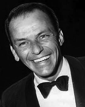
     After taking this class, I really think more critically about commercials, pictures, ads, and graphics that I see. I have learned a great deal from this course and I will apply my knowledge whenever it is appropriate.

Wednesday, April 18, 2012

Mathematics, Differentiation, & Technology!

For this week, I created a toolkit based on mathematics, technology, and differentiation! (Check it out!) I decided to explore the topics before actually creating a name for my toolkit. I came across a lot of articles regarding mathematics, technology, and differentiation. So, I thought of my first colleague: another young mathematics teacher that I share a room with and talk to everyday. As I continued exploring, I saw a lot of differentiation using technology. Then, I thought of my co teacher, who is also young and straight out of graduate school. Thus, I decided to put together a toolkit with articles about mathematics and differentiation using technology. Of course, these are articles that I also find interesting since I am a middle school mathematics teacher and I co teach one period. I figured I could send my toolkit to these two first, and then send it to the other mathematics and special education teachers.


If I were to send my toolkit to an administrator, I would definitely make changes. First, I would not include only mathematics, but all subject areas. I want them to be aware of the resources that teachers can implement in their classrooms. It is important for not only teachers to be aware of these resources, but administrators as well. My toolkit would would a lot longer because there are so many different resources, but I would narrow it down to the articles that relate to the technologies we have available and the curriculum we adhere to.

Although technology is rapidly being implemented in schools, there are some teachers that are afraid of the “T” word. No, not teacher, but technology! All teachers should be willing to accept suggestions and attend workshops regarding technology in their classroom. However, if there still is a teacher that is absolutely terrified of technology, I would change my toolkit further. In my toolkit, I would put things such as worksheet creators, behavior chart cards online, teacher planning chart online, and things to assist him/her first. Then, I would have some article regarding technology for beginners or articles in which you do not need to change your teaching style immensely with the incorporation of technology. Teachers who are reluctant must ease into incorporating technology and they also must recognize how beneficial it is to students and themselves. That is why I would choose resources that benefit the teacher, to show that there is a method behind technology madness, and then resources that would benefit everyone in the classroom.

I really enjoyed creating a toolkit and will continue checking this site to increase my knowledge of technology in the classroom!

Saturday, April 14, 2012

Learning Element

For this week, I planned a learning element for my MMP. I took one lesson, the lesson in which I introduce the golden ratio to my students, and took on the perspective of the teacher and the student (since that is what the learning element essentially is). I critically examined how I looked at the lesson as well as my students. After they have gained the knowledge regarding the golden ratio, they will create their own multimedia presentation of the drawings/images they found that possess the golden ratio.

When I was taking on the perspective of myself, I found writing out the activities more professionally, as when I was taking on the perspective of my students, I was writing in more simplistic language for them to understand. Also, creating the learning element, I thought more critically about the different activities and which sections they belonged in (experimental, conceptualizing, analyzing, and applying).
 

Saturday, February 25, 2012

EDM in 60 seconds

EDM in 60 seconds. What's EDM? EDM stands for Electronic Dance Music. Ever since college, I have been a big "techno" or electronic dance music fan. I've been to concerts in NYC, Miami, Vegas, and Amsterdam. When asked to make a Concept in 60 video, I thought of the footage I have the most of. I am big on taking videos at all of these concerts, so I decided to create a video about my experience at EDM concerts. Usually these concerts last up to 6 hours (with multiple djs), so it was hard for me to break it down to 60 seconds, but I did it! I used Axwell- In the Air as my song (after I stripped all of the original audio) because the rhythm goes with the videos and the song is played by almost all djs. Also, the lyrics represent how you feel the power and love all around you at these concerts. I also listen to this music when I run because it keeps me motivated and "pumped" up. Here is 60 seconds of my EDM concert experiences starting in NYC, moving to Vegas, Miami, and ending in Amsterdam. Enjoy!


Monday, February 20, 2012

Wait, what's a storyboard?

In my screencast, you will be introduced to what a storyboard exactly is, as well as my MMP. I used PowerPoint to create my "storyboard" and a screen cast to show exactly how I will implement these things into my project and why I used the details I did. Storyboarding is  very beneficial because before I created this, my ideas were all over the place. When I laid out all of my ideas and resources for my storyboard, I realized which ones should go with each other. At first I had the four days of notes all together. I realized, that it was not imperative for students to get the notes in four straight days and that this project could be started without the last two days of notes. Storyboarding really helped me organize my thoughts and exactly how I want to use resources and how I want my audience to view my proposal.


Reference

Sunday, February 19, 2012

On the Border

For this exercise, I took a picture from Italy, cropped it into a square, and then added different borders. I used glogster to put all of the pictures together to compare each of them. I used the first four borders from glogster and the last two I used Picnik.
Here is the original picture:
Here is the picture with different borders:

Border #1 (top left): I choose this black border because I really think it focuses on the picture. Since the border is a heavy black color, I think it make the variety of colors in this picture stick out. It doesn't take away from the picture in anyway.

Border #2 (top right): This border, although it is hard to see, has a pattern similar to the one found on page 197 in the middle. It is a light pink and I think it gives off the bright colored theme in this picture. 

Border #3 (middle left): This border is a thin white line. I wanted to use this one because I really think that the picture itself without a border is beautiful. With adding this white border, it doesn't take attention away from the photo and actually makes me pay more attention to the elements in the image.

Border #4 (middle right): I choose this border because I wanted to "pull out" a color from inside the picture. This border matches the houses found in the very middle of the picture. I think this border gives off the theme of this picture belonging to a community.

Border #5 (bottom left): I wanted to test the thin black lines as a border as well for this picture. This border is simple and does not take away from the photo. I think this border adds structure to the picture and adds a "professional" look. I think this border makes the viewer look directly at the picture because it adds a clear ending to all aspects of the picture.

Border #6 (bottom right): This is a border I found on Picnik.com. It is called the "mirror" border because if you can see, it is like a blurred mirror of the parts of the picture it is laying over. I think that it adds a bit of popping up of the border, but it allows the viewer to focus fully on the picture. Furthermore, the border keeps with the colors of the picture.

In all of these borders, I wanted to keep with the theme and the colors within the picture. I learned from Krause (2004), "Edge treatments can be used to reflect and enforce the mood of an image- moods ranging from passive to frenetic, from ornate to industrial" (p. 196). I really think that these borders keep with the theme and reflect on the colors and beauty of all aspects of the picture. I always just put borders on pictures to add something extra, but it is important for me to focus from now on to use a border that keeps with the theme and colors within the picture.

Krause, J. (2004). Design Basics Index: A Graphic Designer’s Guide to Designing Effective Compositions, Selecting Dynamic Components & Developing Creative Concepts. HOW Design Books: Cincinnati, OH.

Friday, February 17, 2012

Keepin with the Theme

While reading about themes, I decided to do the exercise on page 303 in Design Basics Index (2004). I liked the book title, Flirting with the Bully, which reminded me of flirting with the enemy. I immediately had several ideas cross my mind. I wanted to go for a theme where it was playful and "school romantic" but at the same time keep it as looked down upon, not a great love. So I decided to use glogster.com to create this cover:
 I thought this represented flirting, but not in a good way. The main heart, with the title, has spikes sticking out and the second is more subtle with clouds over it and it is dripping with "fail" in the middle. I wanted the title and theme of flirting to pop out so I only used color with the main heart. I use the Polaroids to represent hidden pictures because they are blank, since flirting with the bully is not something you want to brag about. The font I used was more about giving off a flirty look instead of something horrific. 

Here is my second cover. I chose the background for this to represent another school theme, like writing notes to the person you "like". I have the camera because it is representing another scandal, since no one would approve of flirting with the bully. The text adds to the frowned upon theme in this along with the words. I put the words to give off that gossip that is usually found in schools among all students. These words are negative, because once again flirting with the bully is not a positive thing.

After doing this exercise, I realized how important it is to really give off a theme. It is important to establish a theme first, and then build on your image/project surrounding that theme. It is important to have images and graphics that go along with your theme so viewers know what message you are giving off.